Designing a new application in oncology requires researching the needs of potential users, real patients. We present the process of discovery we undertook to gather information and create a new digital tool.
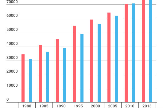
The number of patients with cancer is increasing every year. In 2010, there were approximately 140,500 patients with cancer in Poland. They are patients who are going through one of the most difficult challenges that a human can face.
Regardless of the diagnosed cancer type, these people face enormous emotional, mental, and physical difficulties. My task at The Story was to think about these challenges and how we can help patients face them.

Applications for patients. Step one: How?
The task I faced was intimidating. I needed to understand someone I don't come into contact with very often. As a designer, I was deprived of the ability to relate the project to myself. Under these conditions, I had to find out the following:
- What does the process of oncological therapy look like?
- How do patients gain knowledge about the disease?
- How do patients know how to proceed during therapy?
- What structural problems do patients with cancer face?
- I could use some experience in conducting exploratory workshops. These are meetings during which I gain knowledge about the patient, business, or potential users.
Why is it worth creating projects for people fighting illnesses?
Is it really worth designing digital products for patients with cancer? There are many arguments against it. First of all, patients struggling with cancer are primarily seniors between 60-80 years of age. This is not always the most enthusiastic demographic when it comes to embracing digital solutions.
Secondly, can people with a sickness really expect help from an application? Especially when they are facing such a huge challenge. How can an application help patients with cancer? I asked myself these questions, which only intensified my desire to consult a professional that could supplement my gaps in knowledge.
Cooperation in examining the needs of patients with the Onkocafe Foundation
The composition of exploration workshop participants is a crucial success factor for this meeting. It's best to gather people with different points of view, professional experience and views to obtain valuable information.
In my case, I didn't want (at that time) to invite the patients themselves. I had to be much better prepared for such a conversation. I can't waste the time or energy of seriously ill people. I wanted to come to them with a prototype of a solution.
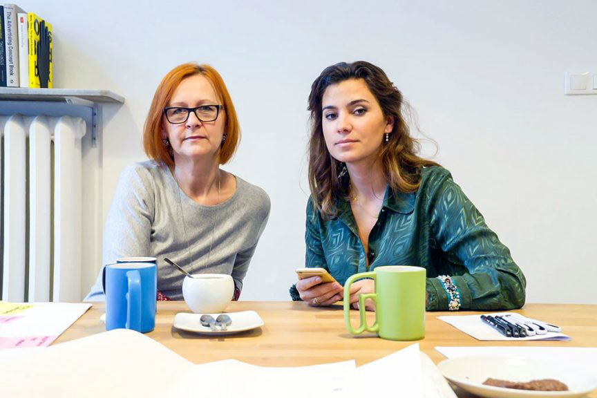
I asked for help from specialists: psycho-oncologist Adrianna Sobol and the founder of the Onkocafe foundation — Anna Kupiecka. Both workshop participants have extensive experience working with cancer patients. They participate in the therapeutic process and contact patients from various cities or social groups daily. They were the perfect partners for me to explore the process that patients go through and examine their needs.

A Workshop on examining patients' needs
Due to my assumptions, I assigned four main goals for the workshop:
- Acquiring knowledge.
- Description of the patient's therapeutic path.
- Diagnosis of the problem.
- The introduction to creating a persona — a personality model of a potential user of our solution. The creation of a persona allowed us to direct the entire workshop towards actual activities, not just discussion.
I used ordinary sticky notes and markers to build the path patients follow during therapy. We marked each stage with a subsequent note. Colors also mattered. In the following exercises (when I was already strongly empathizing with model users) together with Adrianna Sobol and Anna Kupiecka, I marked:
- Contexts of therapy stages.
- The emotions that accompany model users at these moments.
Applications for users — Research methodology
The results had to be organized, documented and understood.
The best way to understand large amounts of data is to play with them — produce the so-called "Disfluency," that is, experiment with information. It can be sorting and categorizing, which "creates understanding." Thanks to these experiments, I approached the next meeting as an active designer. I still had many gaps in knowledge, but now I had a general understanding of the subject.
During the second workshop, we were able to answer the basic questions that had troubled us at The Story from the very beginning of the process. What is the most important structural problem of people with sickness? How do they acquire knowledge about therapy and disease?
What's more, we've also answered a number of other questions: What value will we add to ensure users come back to our e-health solutions? How much time can they spend on learning about the solutions? How will they reach them? Will patients only use our application? Can we imagine the context of using the e-health application — everyday and extremely frequently?
After this strategic stage, I decided to take a chance, and as a final exercise, I proposed an application storyboard — eight screens to help the patient solve the problem. The task ended partially successfully. It's very difficult for people who are not used to drawing solutions to suddenly switch to this mode of thinking. However, sketches (or rather stories) made during the workshop proved to be extremely valuable at the stage of creating application mockups.
Comparison of two applications — Concept test
I finished working on mockups with two application concepts: one resulting from the workshop and the other being the idea of Dymitr Romanowski — CEO of The Story, who also participated in the workshop. Each of them met a different need and purpose of the user; each approached their emotions in a different way.
While testing the early concepts, I first wanted to check which application, with its description, worked better for participants. Therefore, each of them first read the descriptions and then could test the application of their choice. In total, five patients took part in the concept tests.
During the test, it was a challenge to keep testers' attention on specific, previously invented tasks describing the context of using the application. That is why I decided to refer to the memories from therapy. Thanks to this open approach to testing, we have obtained additional information about the histories of individual patients.
An app for patients with cancer — Results
Finally, one of the ideas was "emotionally strong," while the other was much more practical. However, patients indicated that in cancer therapy, practice is key. An application focused on specific actions has a much greater chance of success.
Hero shot: Edward Ardizzone, "A Patient in a Medical Aid Post."


