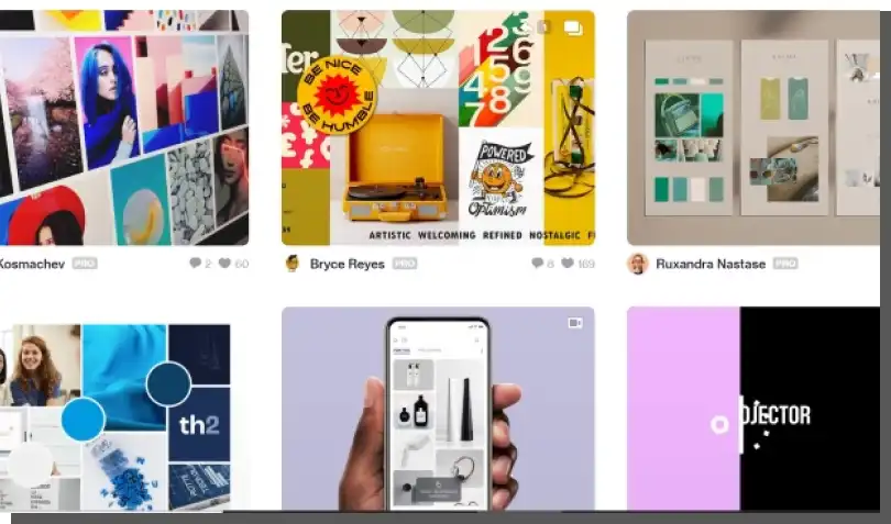
What are Mood Boards? A Mood Board is a board, not a random arrangement. It is a set of images, graphics, photos, and texts whose task is to present a style or a visual concept of a design idea.
Mood Boards are often used in UX/UI design (e.g., as a model design or a source of inspiration), so today, we will tell you a little about them.
What are Mood Boards all about?
We can describe Mood Boards in a single word. They are tools used by most designers in the creative industry. Most often, they are used by:
- Interior architects
- Art directors
- Filmmakers
- Photographers
- Graphic designers
- Fashion designers
- Device designers
- UI designers and a number of other people, not necessarily designers, but opinion makers and decision-makers.
It's always a good idea to maintain balance, so we should point out that Mood Boards aren't primary tools. They have more of a supporting function in the design process.
Because of the small amount of time required to create them, their simplicity (anyone can make them), and their illustrative nature, which is invaluable when presenting ideas (inside a team and with external stakeholders), they're very popular.
It's hardly surprising.
A Mood Board, created from publicly available materials, conveys the specifics of a project in a quick, intuitive, and simple way. It gives an idea of the aesthetics and emotions it stirs.
A glance is all it takes to understand what a project team wants to achieve, what solutions they're looking for, what solutions are the starting or access point, what inspirations they refer to, and what design they are interested in. Okay, it isn't always easy and obvious in practice, but it should be and can be.
A Mood Board is usually a collage of typical graphic elements – colors, forms, shapes, photos, typography, positive inspiration and patterns, materials, and even animations and videos. We should add that, at the same time, it isn't a collage of random elements but a coherent whole, a consistent design.
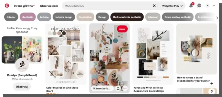
It's supposed to reflect the direction of visual, aesthetic, and functional search, as well as inspiration. Aesthetics and design are mainly about emotions, hence the presence of the word mood, which means, among other things, a dominant emotion. But don't let that fool you. It's not about pretty pictures from Pinterest or Dribbble. Mood Boards are more than that.
Types Of Mood Boards
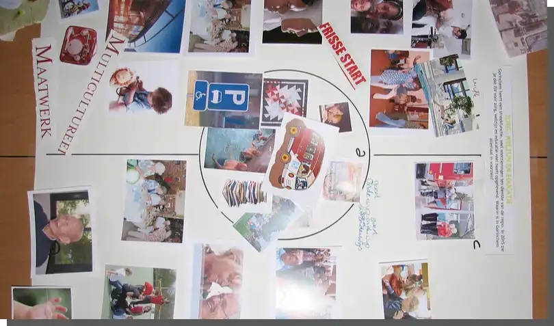
Mood Boards come in two basic forms – analog (photos, graphics, prints attached to the board) and digital.
And if you think that analog variants aren't useful (or that they require special materials) when creating digital products, you are mistaken. They are, and very much so.
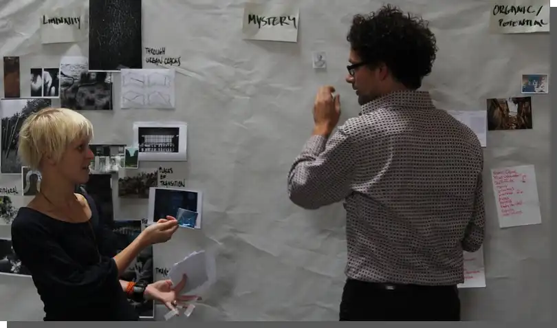
A Mood Board hanging in a room where designers are working and discussing a project serves as a non-intrusive reminder of the project's key ideas. It's a useful source of inspiration for many people – not just designers.

A different division distinguishes two types of these tools, except that the distinguishing characteristic isn't the medium but the utility of this tool. As the name suggests, a Literal Mood Board is used to precisely identify individual elements (e.g., fonts and colors).
In contrast, a Practical Mood Board is less concrete, more abstract, and can be used to communicate general feelings and moods that a digital product is meant to evoke.
Each solution has its advantages and disadvantages. We'll create a digital Mood Board faster, but it won't have such a "public" character. A digital file is easier to ignore, although it's easier to edit, format, and share with those working remotely.
The analog Mood Board doesn't allow us to see animations, but we can create it in a much larger size. The size of a phone screen or monitor does not limit it.
Stationary Mood Boards can be created during brainstorming sessions, while digital variants are much more individual. But they also require materials and are handmade. The Practical Mood Board is literal, but it can lack flair. And vice versa.

It's difficult to judge the superiority of one type over the other. It's always a matter of goals, preferences, capabilities, and the nature of the projects involved.
What a Mood Board usually contains?
A Mood Board is a tool that can contain any useful content from a UI perspective. The absence of some elements doesn't make the Mood Board less useful or defective. Usually, we will find on it the following:
- Interactive elements
- Photos
- Graphics
- Iconographies
- Illustrations
- Text fragments with typography
- Color palettes
- Shapes, forms, dominant figures, design
- Button styles (e.g., on a website or mobile application).

The most important rule is the consistency of all elements, their relevance, and legibility. A Mood Board overloaded with information may simply be less communicative.
We should keep this in mind so that we don't make it a storage room but a tool to introduce stakeholders to the project's fundamental assumptions.
When should we create Mood Boards?
Mood Boards are useful from the earliest stages of a project. Without taking unnecessary risks, they allow us to clarify the scope of exploration and inspiration and indicate the main goal, effects, gains, risks, and challenges.
Mood Boards are most often used to:
- Make the concept more precise, to give it, even if only provisional, visual concreteness
- Make an approximation, give an idea of the result
- Stimulate imagination, inspire
- Correct decisions, ideas, solutions
- Fit in, or separate from, current visual conventions
- Select leads, ideas, and concepts.
We should pose these fundamental questions as early as possible, and Mood Boards are an ideal tool for this task.
Why should we use Mood Boards?
People say that their main advantage is to inspire. But this is a far too narrow an understanding of their usefulness.
Most of all, they make it possible to:
- Find the desired style, the right tone, and color
- Define values, goals, and means
- Organize elements and establish their hierarchy (e.g., on a website)
- Identify aesthetic and emotional dominants
- Exchange opinions, aggregate ideas
- Communicate and concretize ideas – express them in a proper language (photo with photo, icon with icon)
- Identify discrepancies in a project team
- Confront designers' visions with customers' expectations
- Set standards, establish conventions
- Speed up the search.
Their communication value is essential because it allows for a more concrete, example-based exchange of information, opinions, and evaluations between designers, other team members, and between a team and a client. Feedback from a customer at an early stage of the work avoids misunderstandings and disappointments, always resulting in a waste of time and energy.
How to make a useful digital Mood Board?
As with most tools for communicating ideas and concepts, consistency, conciseness, and legibility determine the usefulness of Mood Boards. A Mood Board should highlight the main concepts, even with a cursory look.
Concepts that concern the style (e.g., modern, retro), color scheme (e.g., the dominance of warm colors), tone (e.g., light or serious), status (e.g., casual or occasional, festive).
Moderation and selective choice of elements are also essential to understand the main idea, not necessarily in every tiny detail. Mood Boards are illustrative tools, not prototypes. That's why they are more general and less detailed.
They guide the thinking process; they don't necessarily provide examples of specific solutions. Mood Boards must be consistent within a given project and suggest consistency of new products at the product, brand, and enterprise levels.
Mood Boards, from the above description, may seem like tools for communicating visual ideas only. Fortunately, this is only a false impression. A best practice related to their design is to complement all visual, audiovisual, and animated elements with a verbal commentary that helps to clarify and explain ideas.
Admittedly, one photo is worth a thousand words, but this one word can resolve a thousand doubts that a photo may raise. Therefore, it's worth taking advantage of all capabilities and making Mood Boards as helpful as possible. They must convey patterns, emotions, impressions, and specific information.
When creating Mood Boards, we should pay special attention to the following:
- The strength of reaction – a Mood Board that doesn't arouse emotions should prompt you to rethink the concept
- Realism (photos, graphics, animations) – they should suggest solutions that are achievable and desirable
- Complementarity – using digital Mood Boards interchangeably with analog ones, depending on the needs, is always the right solution
- Usability – they're meant to solve specific design problems, not just to inspire
- Communicativeness – elements should form a hierarchy established according to the relevance criterion, which should be communicated by the size of a given element.

Mood Boards – key questions
When creating a Mood Board of any kind, you can't overlook general issues. While important, focusing only on the problems of form, style, aesthetics, and beauty will only partially serve the result.
When creating Mood Boards, we also need to think about crucial questions:
- What should make the project stand out?
- What is the purpose of a project in terms of business, aesthetic and emotional aspects?
- What users' problems are solved by the designed digital product?
- How to combine business goals with users' goals?


