The perfect patient diary. How clinical trial participants fill in their patient's diary.
When left to themselves, clinical trial participants often fail to fill in patient's diaries. However, it is crucial that researchers obtain the correct data, because the success of every clinical trial depends on this.
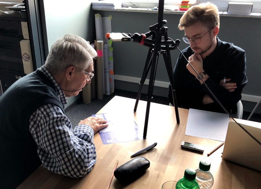
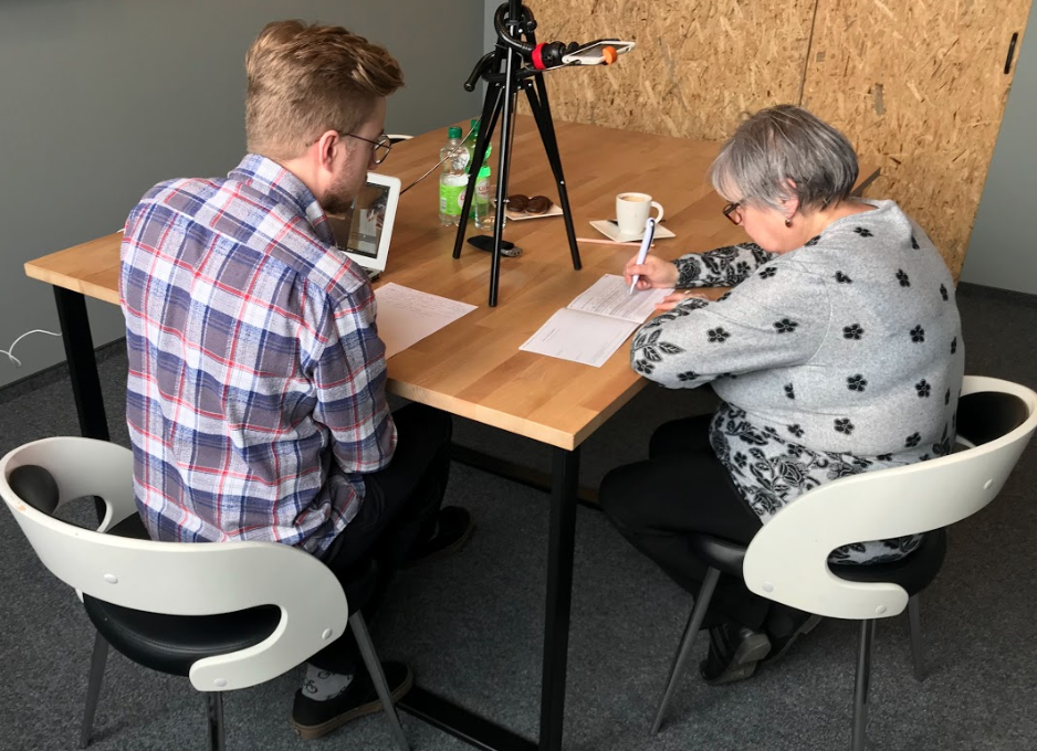
To better understand what causes difficulties when filling out the patient's diary, we conducted assisted usability tests.

To conduct a study of patient diaries, we used the in-depth interview method combined with task tests. The test took the form of an in-depth interview, during which our contact had to assume the role of a participant in a clinical trial. Participants were persons who corresponded to the same demographic profile as the participants of a real clinical trial.
Task tests are most often used when designing digital products (product design), but the method is useful when designing any solution that is supposed to offer the user a predetermined functionality. In this case, we examined a diary which is intended to be filled out daily by the patient at home.
We set a simple task for the respondents. We asked them to complete the diary as if they were patients themselves. The contents of the task set out the course of their symptoms and accompanying circumstances in the days following participation in the clinical trial. The condition for the correct performance of the tasks was to find, read and understand the instructions explaining how to deal with the diary.

Starting with the obvious conclusion - the appearance and graphic arrangement of information have a decisive influence on both the readability and use of the diary
Using a table as a solution for presenting questions and answers causes the respondent to focus attention primarily on this element - on finding and selecting the appropriate boxes. As a result, all additional information, and very important instructions, were completely overlooked by patients and were simply "information noise" to them.
Subsequent observations have shown that the instructions were literally "transparent" to the subjects. Furthermore, information and commands presented in a table format but formatted differently from the main symptom table were also ignored.
The lack of visibility was confirmed by the question: "Why is the diary filled out by you in this way?" which caused some anxiety. While answering, respondents referred to "intuition" or the "clarity of the table layout". The layout, it turns out, led people to believe that this was the content that needed to be filled out.

This intuitiveness is another important aspect of designing for the user (UX design). Solutions should comply with the general principles of cognitive science and ergonomics. An example of a well-designed element in the diary is the three-point scale to evaluate the intensity of the symptoms. The element was answered correctly by the respondents, even though almost none of them noticed the instructions for it.
In this case, the intuitiveness of the answers in the form of a scale was determined by the order of intensity from the smallest (1) to the largest (3) and the form of circling the correct answer. It resembled the type of multiple choice question often used in forms or tests.
An additional confirmation of the thesis regarding the user's attention on the table was a request to the respondents to read the instructions that had previously escaped their attention. It turned out that they were understandable and in most cases, the subjects correctly interpreted the content of the instructions. Moreover, they themselves noticed in which places they completed the diary in a way that didn’t comply with the given guidelines.
We prepared over 80 good practices and tips that a designer should follow when creating a patient's diary. As a result, we designed an appropriate tool that was introduced into a phase 3 clinical trial of a new drug. A total of over 10,000 patients from 8 countries will participate in this study.