
Today we will discuss Pagination. What is Pagination? What hides behind this mysteriously-sounding word? What is Pagination in E-Commerce?
Pagination — in a traditional editorial and publishing sense — means numbering the pages of a book or any other printed material in the form of a newspaper, magazine, or catalog.
In the design of websites and online stores, the — Pagination of websites — means dividing the site's content into successive subpages.
Pagination has a significant role in creating a positive user experience.
Successive subpages are usually connected in thematic, logical, functional, or otherwise important for the user way that is understandable and readable to them.
The content of subpages should be consistent, adequately presented, and wide enough to give the sense of comfort of choice and narrow enough so that the comfort of choice doesn't turn into the nightmare of choice.
Balancing these two needs and conditions is a very individual issue and requires dedicated tests and UX research.
Although it may seem inconspicuous and insignificant, Pagination causes problems that significantly impact how purchases in the store are experienced and evaluated and how and with what effect they are progressing. It directly affects the volume of sales and the willingness to repeat them.
Alright. So much for the introduction. In the following part of the article, we will discuss Pagination and design patterns recommended for online stores.
Pagination of websites — benefits
A website, and in particular, an online store that is overloaded with content and functionalities, is a website that doesn't provide a good user experience. It becomes a dysfunctional site whose usability is very low.
It's challenging to navigate it, and the sense of overabundance, chaos, and the number of made mistakes increases. It's easy to feel overwhelmed, and it's easy to get lost.
The interaction with such a website poses a big challenge for users' working memory, and their level of focus must be exceptionally high.
Fortunately, Pagination eliminates these undesirable effects.
Pagination of the website allows you to:
- Quickly and easily navigate and reach the important information and searched products
- Increase the control over available assortment, the collection obtained in search results
- Improve conversion
- Orient website activities toward sales
- Illustrate the range of available content.
However, the Pagination of the website is not the only method of dealing with the problem of page overload.
Currently, in E-Commerce, a few conventions are used to present the site's content. The most common include the following:
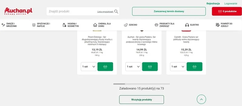
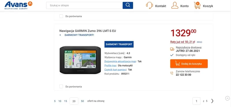
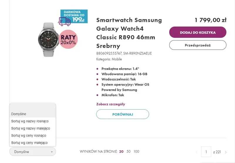
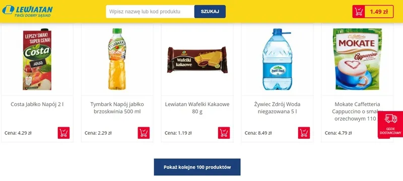
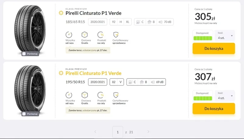
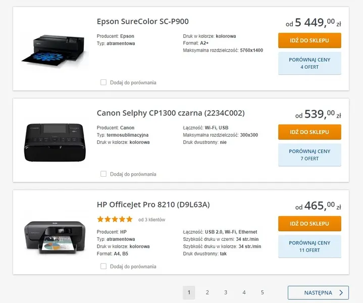
- Pagination: indicates the number of pages to which access isn't linear
- Lazy Loading: uses the button "Load More"
- Infinite Scrolling: successive blocks are loaded without performing any action.
As you might guess, all these solutions have their strong and weak points, and they're more or less useful in regard to the following:
- Customers' goals (buying vs. browsing)
- Business objective
- Channel (desktop vs. mobile)
- Nature of the products
- Criteria, relevance, and adequacy of the content and results presented on various pages.
The choice of a specific solution or configuration of solutions is a very individual matter. Hence, each time, it should result from a separate analysis of particular goals.
Pagination in an online store — what does Pagination look like in E-Commerce?
Pagination of the website is not a purely aesthetic problem but an essence of issues related to the usability of the online store and user experience, which determines the competitiveness in E-Commerce.
It involves a classic dilemma of whether the site's content should be divided (Pagination) or presented without the division.
It forces you to find an answer to the question: Is clicking on successive subpages — from the perspective of users/store customers' needs — more convenient, easier, and less costly than scrolling or clicking the "Load More" button?
Also, it makes you look for, particularly on product category subpages, the answer to the question of the optimal amount of products that should be presented on a subpage.
As the researchers from Baymard Institute observed in the article "Product List UX: The Number of Products to Load by Default (52% Get it Wrong)," the number of products presented at one time (on a single subpage) has to be the result of maintaining the balance between the loading speed of the page and the optimal scanning, comparing and product selection processes.
However, here, speed has two meanings. It's about the speed and the immediacy of page loading, which translates to a positive UX and CX and is compatible with E-Commerce customers' expectations.
It also is significant in terms of marketing regarding the fulfillment of internet browsers' requirements. We wrote an article, "Google's algorithm introduces Page Experience — UX will affect the website's position in Google," about the relationship between Page Experience and UX.
Of course, determining the number of products presented on a product list is always a problematic issue and is conditioned by the following:
- Nature of the products, industry, and its specifics
- Customers' expectations build on experiences from competitive online stores
- Design trends
- Channel
- The number of products in the store.
In other words, "What do I sell?", "To who do I sell?", "At what moment do I sell?" influences "How I sell."
In general, the amount of offered products raises two problems:
- Oversupply (paralyzing overabundance)
- Scarcity (discouraging deficit)
In the first case, customers of online stores feel disoriented and overwhelmed. Paradoxically instead of enjoying the vast selection, they feel unpleasant emotions, which often motivate them to abandon the store (the phenomenon of abandoned shopping carts sometimes has its source in incorrect or not offered Pagination).
The situation looks similar when products are in short supply. A sense of absence, of loss (of a chance, possibility, choice) results in the same reaction.
Although Pagination allows you to offer more control over the content browsing process and navigating through it, it has to be provided in a thoughtful manner adequate to the capabilities and needs of users.
It should, above all, serve all the users in familiarizing themselves with the assortment and products in the most economical way possible.
Regarding time, cognitive processes, or resulting from the number of necessary actions to be performed.
How to paginate pages in an online store?
The number of offered products on a single subpage is obviously a crucial value. But what, in fact, most significantly affects this value?
We've already listed essential factors. But we must make a small remark regarding them. According to the Baymard Institute research, the most crucial matter is the nature of products.
In line with the division proposed by the researchers, you can look at products in a twofold way. In the case of Visually Driven Products, the sales appeal depends on, to a large extent, their visual presentation. The quality and number of photos is the fundamental issue when it comes to selling these products.
In the case of Spec-Driven Products, easy access to specifications, certificates, expert opinions, benchmarks, and usability tests plays a key role. It's certainly more dependent on the quality of verbal, technical messages than visual ones.
Regarding the first ones, visual messages (e.g., thumbnails) are more eye-catching, natural, and compatible with expectations. When it comes to the second category of products, the more potent attractors are words and numbers.
As a side note, the division proposed by researchers from Baymard coincides with the division described by us in the article "Product Comparisons. How to do it right". The assignment of a product to the Search Goods or Experience Goods categories is an aspect of the same problem. It's about the way the product is used, which affects how it is bought.
Specialists from Baymard, based on their numerous studies, say that products that are more dependent on visual presentation can be displayed on a single subpage in greater quantities. Why?
Because they are viewed through scanning the photos and not by reading labels or descriptions, scanning photographs, even small ones, involves less cognitive effort than the need to read and understand the text.
So what is the suggested number of products per single subpage?
Between 50 and 150 — that's what researchers from Baymard suggest in terms of E-Commerce.
Regarding M-Commerce, the number of products should range from 15 to 30.
Which comes from, among other things, the available space and the method of navigating (mainly with the thumb).
Pagination in a mobile version of an online store
The design of navigation in M-Commerce, searching, and presentation of products always have the specification of mobile devices as their basic reference point.
Regarding their physical features, typical ways of using them, performing tasks, and characteristic functionalities.
In other words, the design of Pagination in E-Commerce and M-Commerce involves the need to solve significantly different sets of design problems.
Tactility and limitations resulting from the size of the screen and a wide range of different issues, which we discussed in our articles (Task-Oriented Design in Mobile Design, Design strategies for mobile applications) influence the need to adapt the division of the content of the site to the requirements of the mobile channel.
In the case of M-Commerce, the most recommended solution is to offer Infinite Scrolling which provides the following:
- Better user experience
- Better usability
- Improved smoothness — scrolling is a more natural way of interacting with an interface in M-Commerce
- Greater engagement in the process of exploring the content of the site
- Fewer errors resulting from taps (essential when you offer the division through classic Pagination).
Although it is a recommended solution, you can't forget that it also has flaws. Infinite Scrolling in most cases in M-Commerce can result in the following:
- Fatigue, especially when the content is extensive, and the offered ways of sorting, searching (e.g., faceted search), or filtering are limited
- Sense of navigational confusion, the user has a problem with returning to the beginning of the page or reaching the page footer, even though they don't have to go through successive subpages.
Remember that scrolling through long lists, for example, product lists on category pages, in M-Commerce is much slower than in E-Commerce.
It takes much more time and is seen as more difficult, tiring, and less friendly than navigating through the site on a desktop computer.
The need to scroll a dozen or a couple of dozens of items and products in E-Commerce and M-Commerce involves entirely different experiences.
In the first case, it is seen as a standard action; in the second, it is work- and time-consuming.
Hence a good solution is to apply an adequate Pagination and present an optimal number of products on subpages.
Pagination in E-Commerce. Summary
- Pagination regarding the design of websites and online stores means dividing the content into successive subpages.
- As a result, these subpages are usually related to each other thematically, logically, and functionally.
- The content of subpages should be simultaneously consistent, adequately presented, and optimal in terms of range. The number of products presented on the subpage at one time can't be too large or too small.
- The website that doesn't use Pagination has low usability and doesn't provide a desirable and satisfactory UX.
- Pagination allows users to navigate and reach products quickly. It also provides more control over the available assortment and the collection of results and enables users to visualize the range of available content.
- In M-Commerce and E-Commerce, a few conventions are used to present the site's content. The most popular include Pagination, Lazy Loading, and Infinite Scrolling. They're used as sole or mixed solutions.
- The number of products displayed on a single subpage must result from the balance between the loading speed and the optimal scanning, comparing, and product selection processes.
- Determining the optimal number of products presented on the product list is always a problematic issue. It is conditioned by the nature of the products, the industry and its specifics, customer expectations, channel, and the number of products in the store.
- The amount of offered products raises two problems: overabundance or scarcity of products.
- Pagination should be offered thoughtfully and adequately to the capabilities and needs of users.
- The number of products offered on a single subpage depends, to a large extent, on the nature of the products.
- In the case of Visually Driven Products, it depends on their visual presentation. In the case of Spec-Driven Products, easy access to specifications, certificates, expert opinions, benchmarks, and usability tests plays a key role.
- Products that depend more on the visual presentation can be displayed on a single subpage in more quantity. Scanning the thumbnails involves less cognitive effort than the need to read and understand the text.
- The optimal number of products displayed on a single subpage ranges between 50 and 150 in E-Commerce and 15 to 30 in M-Commerce.
- The design of Pagination in M-Commerce and E-Commerce involves the need to solve significantly different sets of design problems.
- In the case of M-Commerce, the most recommended solution is to offer Infinite Scrolling which provides a better user experience and usability in this channel.
- While designing Pagination in M-Commerce, you should remember that scrolling through long lists in this channel is much slower than in E-Commerce. It takes much more time and is seen as more difficult, tiring, and less friendly.


